
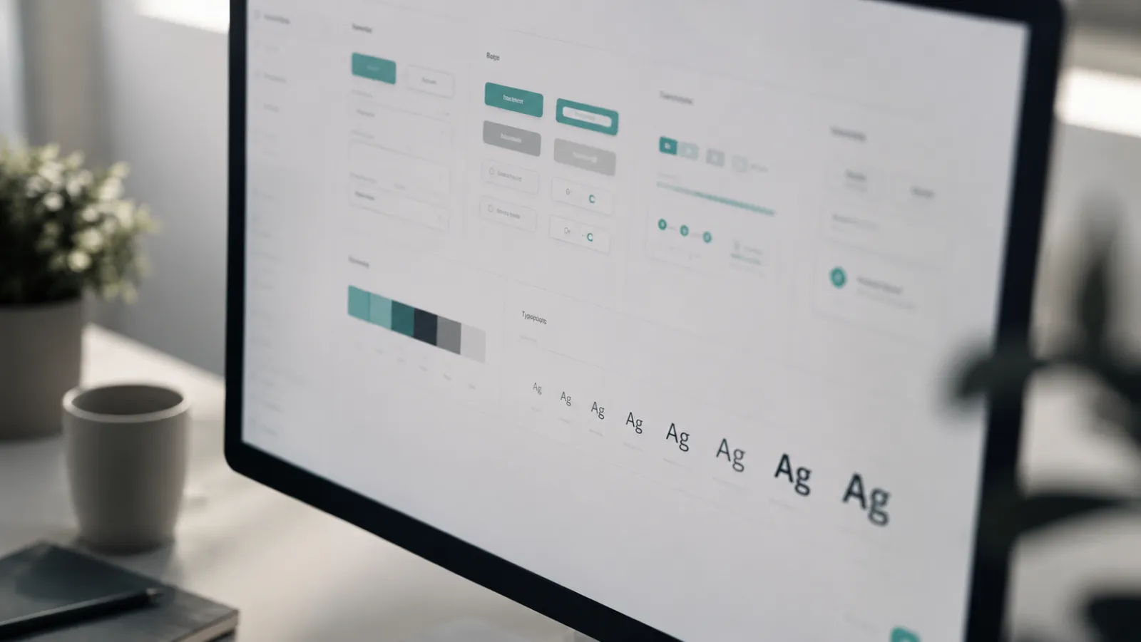

A design system is decision logic, not a component catalog
Many teams treat "building a design system" as assembling buttons, cards, and color tokens in a library. That is the visible part, but not the valuable one. A component catalog answers "What does a button look like?". A real system answers the harder question: "When do I use which button, with what text, in which hierarchy?"
That difference decides whether a system holds or falls apart. Without documented decision logic, every team member chooses by taste. Three designers build three plausible solutions to the same problem, all "on system", yet the product feels inconsistent. Consistency does not come from shared components, it comes from shared decisions.
A reliable design system therefore documents rules, not just building blocks:
- which action is primary, which secondary, which destructive?
- which information belongs in a card, which on a detail page?
- when do we use a dialog, when an inline message?
- what tone applies to error messages, and what to confirmations?
Only once these questions are answered does a component library become a system with substance.
Hierarchy and reading flow: how users find the next step
Every interface asks the same silent question: what should I look at first, and what do I do next? If the hierarchy does not answer it, the user answers it themselves, by searching, scrolling, and guessing. That is cognitive load we can remove.
Good reading flow orders elements by importance, not by what is convenient to build. Three levers carry most of the weight:
- visual weight: size, contrast, and position steer the eye toward the main decision
- grouping: related content sits together, unrelated content is separated
- rhythm: consistent spacing creates scannable blocks instead of a uniform wall of text
The most common mistake is equal weight for unequally important elements. When everything is emphasized, nothing is. A page with five equally sized calls to action guides no one; it hands prioritization to the user. Hierarchy means having the courage to treat things unequally.
Reading flow is not a one-time act but a continuous line across the whole page. The eye should be led from the most important information to the main action without getting caught on equally weighted stimuli along the way. Where many elements compete for attention, a simple test helps: squint, and it should still be visible what counts first. If everything stays equally gray, the hierarchy is missing.
Typography as the navigation system in an interface
In text-heavy products, typography is not a stylistic detail but the actual navigation system. Before a user interprets an icon or reads a color, they read a page's structure from its type. Headline, lead, body, and meta tell them in a fraction of a second where they are and what matters.
A workable type scale uses few, clearly distinguishable steps:
- a decisive jump between heading and body so levels register instantly
- consistent line heights and spacing that create a readable rhythm
- a line length that does not tire the eye
- restrained but reliable markers for links and interaction points
This logic connects directly to content-first structure work: only when content exists as structured objects with fields can typography reliably express its hierarchy. Type is the surface of structure, not a substitute for it.
Microcopy: language that guides actions instead of filling space
UX writing is not the late-stage filling of text fields, it is part of interface design. Every word on a button, in a label, or in an error message makes a decision about clarity. Microcopy guides when it is concrete and action-oriented, and merely fills when it stays generic.
The difference shows in small places with large effect:
- a button says "Book appointment" instead of "Submit", because it names the outcome
- an error message says what to do, not just that something is wrong
- an empty state explains the next step instead of showing only "No data"
- a label describes the content, not the technical field behind it
Good microcopy reduces uncertainty exactly at the moment of action. It is where the design system and language converge, because a button token without a text rule is only half specified.
Three checks help separate microcopy from filler text:
- does the text name the concrete action or only describe it abstractly?
- after reading, does the user know what happens next?
- could the text be replaced by a generic default word without losing meaning?
If a generic replacement costs clarity, it was good microcopy. If it can be swapped without consequence, it was decoration.
“Microcopy is not ornament on an interface. It is the language in which the system makes decisions with the user.”
Reduction with priority: good minimal design vs. empty design
Many treat reduction as a quality in itself. That is a fallacy. Fewer elements do not automatically mean more clarity. The difference between good minimal design and empty design lies not in quantity but in prioritization.
Good minimal design removes what obscures the main decision and keeps what supports it. Empty design removes whatever can be removed and shifts the load onto the user, who now has to infer what is missing. The question is never "Can we drop this?" but "What does the user need before the decision, and what can move into context?".
The article Minimalism is not the absence of elements deepens this view. Reduction without a decision system stays aesthetics. Reduction with logic becomes guidance.
Scaling consistency: tokens, patterns, editorial rules
A system proves itself not in the first screen but in the hundredth. Once several people work on a product over months, the scalability of consistency decides the quality. Three layers carry it:
- tokens: colors, spacing, and type steps as named values, not scattered one-off decisions
- patterns: recurring solutions for recurring problems, such as forms, lists, or empty states
- editorial rules: a UX writing guide with tone, terminology, and examples for the most common cases
Tokens deliver visual consistency, patterns structural consistency, editorial rules linguistic consistency. Where a layer is missing, the system drifts apart exactly there. The linguistic layer is often forgotten, although it is the most visible in daily use, because users read more than they consciously look at.
This structural logic carries across languages too: in data-intensive products like the InterviewApp, consistent patterns and precise microcopy noticeably lower cognitive load, especially when many pieces of content must be coordinated in little space.
From design system to reliable delivery
A design system is only worth something when it holds up in implementation. Between a beautiful component library and a maintainable interface lies the delivery question: can the system be maintained over time without falling apart with every new feature?
Reliable delivery emerges when design, content, and code share the same decision logic. Tokens become variables in code, patterns become reusable components, editorial rules become required fields in the content process. The system stays consistent as it grows and as the people involved change.
The connection to the information architecture of a relaunch is central here: a design system can only be as clear as the structure of the content it presents. Structure first, then system, then surface, in that order.
States and edge cases as part of the system
Design systems are usually built for the ideal case: filled lists, short titles, complete data. Daily reality looks different. A list is empty, a name is twice as long as planned, a load takes time, an input fails. These states determine the perceived quality level, because they occur more often than most teams assume.
A reliable system treats states not as exceptions but as mandatory parts of every component:
- the empty state explains what to do next instead of only showing "no entries"
- the loading state signals progress without losing the hierarchy
- the error state names cause and way out in one sentence
- long content wraps in a controlled way instead of breaking the layout
This logic ties UI and UX writing inseparably together: an empty state without guiding microcopy is only half a solution. Designing for states builds a system that stays calm under real conditions, not just in the showcase.
How we introduce a design system with substance
A system does not emerge from a single large project but from an ordered sequence. In practice, a three-step approach has proven itself, keeping effort and impact in balance.
First we clarify the decision logic: which actions, content types, and tones exist at all, and what rules apply to them? This is the invisible but most valuable layer. Only then does the visible component work follow, that is tokens, patterns, and recurring building blocks. Finally we secure the fit: editorial rules, required fields, and documentation that does not disappear into a drawer.
Three principles carry it through:
- substance over scope: a few patterns applied consistently beat many that no one knows
- rules over building blocks: document the decision first, then build the component
- maintenance over perfection: a maintained, living system beats a complete, dead one
A design system thus becomes not a library project but a tool that speeds up decisions and secures consistency.
Conclusion
A good UI system is not a matter of taste and not a component catalog. It is documented decision logic that ties hierarchy, typography, and microcopy into clear guidance. Reduction becomes a strength when it comes from priority, and consistency becomes scalable when tokens, patterns, and editorial rules work together.
Clarity is not a style you add. It is the result of a system that anticipates decisions so the user does not have to make the ones the product should make for them.
FAQ
How does good minimal design differ from empty design?
Good minimal design removes what obscures the main decision and keeps what supports it. Empty design only removes and shifts the load onto the user.
What role does typography play in minimal interfaces?
Typography is the actual navigation system: through hierarchy, rhythm, and contrast it shows in a fraction of a second where you are and what matters.
When is a dedicated design system worth it?
Once several people work on a product over months and consistency can no longer be held by hand. Then documented decision logic carries the work.
What belongs in UX writing guidelines?
Tone, terminology, and examples for the most common cases like buttons, error messages, empty states, and confirmations, so language guides consistently.